When it comes to giving your home a fresh new vibe, few things are as powerful as color. At Magazines Quick, we believe that your home should reflect not only your personality but also current styles that inspire calm, creativity, and comfort.
Whether you’re redecorating an entire room or simply switching up your accent tones, the latest color trends can breathe new life into your space. By Magazines Quick Color isn’t just a decorative decision, it’s an emotional and atmospheric one.
The right hues can uplift your mood, make a room feel larger or cozier, and turn your home into the sanctuary you’ve always dreamed of. From bold contrasts to soothing neutrals, this year’s top color trends are all about striking the perfect balance between beauty and meaning. Let’s dive into the color palettes that are transforming interiors around the world.
2025’s Leading Color Themes for Homes
Earthy Elegance: Grounded Neutrals Are Back
Warm clay tones
Think terracotta, burnt sienna, and muted rust. These colors bring a cozy, lived-in feeling that’s perfect for living rooms, reading nooks, or even kitchens.
Sandy beige and oatmeal
These light neutrals have replaced stark white in many modern homes. They soften a space and pair beautifully with natural textures like rattan, linen, and reclaimed wood.
Nature’s Influence: Greens that Heal and Revive
Olive and sage
Soothing, rich, and wonderfully versatile. These greens connect your home to nature, helping reduce stress and improve mental wellness.
Mossy and forest tones
Ideal for accent walls or cabinetry, deeper greens can add depth and drama while still maintaining a grounded feel.
Moody Blues: Deep, Dreamy, and Dramatic
Navy and midnight
Deep blues are the new blacks. They’re elegant, mysterious, and ideal for creating a rich backdrop in dining rooms, bathrooms, or bedrooms.
Dusty sky blue and steel blue
These lighter versions bring a fresh breeze into any room, perfect for minimalist or coastal styles.
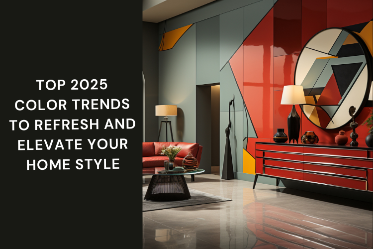
Unexpected Pops: Bold Colors That Make a Statement
Vibrant Coral and Fiery Tangerine
Where to use
Accent walls, hallway doors, throw pillows, and statement art pieces. These shades instantly inject energy and optimism into a space.
Electric Yellow and Acid Green
Best spaces
Game rooms, creative studios, or small powder rooms. These bright shades are all about personality and playfulness.
Primary Red and Royal Purple
How to balance
Pair with cool grays, muted pinks, or soft creams to tone down their intensity. Perfect for eclectic or maximalist homes.
Timeless Palettes That Never Go Out of Style
Black and White — The Power Couple
Still reigning supreme, this combo is classic for a reason. The crisp contrast adds visual drama, especially in kitchens, bathrooms, or home offices.
Soft Pastels — Whisper, Don’t Shout
Pale pinks, lilacs, and mint greens can make small rooms appear larger and add a hint of femininity without being overpowering.
Modern Monochromes: Embracing Tone-on-Tone Styling
What is tone-on-tone design?
Using various shades of the same color family to create a layered, cohesive look. Think blush walls with rose-toned furniture and dusty pink accents.
- Top monochromatic combos
- Soft greys with charcoal and dove
- Warm taupes with caramel and tan
- Blues ranging from periwinkle to navy
Why it works
It creates harmony and makes the space feel curated and intentional, even when layering textures or materials.
Color Psychology in Home Decor
- Choosing colors by emotion
- Blues and greens for calm, healing, and balance.
- Yellows and oranges for energy, cheer, and creativity.
- Neutrals for safety, comfort, and timeless appeal.
- Bold hues for confidence, personality, and self-expression.
Think room by room
Bedrooms: Opt for calming tones like sage, lavender, or muted blue.
Living rooms: Go for warm neutrals or dramatic darks for depth.
Kitchens: Whites, greys, or pale greens give a clean, refreshing look.
Bathrooms: Try ocean blues, stone grays, or soft pinks for a spa-like feel.
Textures and Finishes: Elevating Color with Material
Color isn’t just about paint it’s in everything from fabrics to finishes.
Velvet in rich tones
Emerald, navy, and wine-colored velvet bring luxury and drama to sofas, headboards, and curtains.
Natural woods and woven fibers
Pair beautifully with earth tones and warm neutrals. Think oak, walnut, or jute rugs and bamboo blinds.
Matte vs. Glossy
Matte finishes feel modern and understated. Glossy finishes reflect light and can add glamor, especially in darker shades.
Practical Tips for Using Trending Colors in Your Home
Start small
Try using color in cushions, artwork, or a single accent chair. This allows flexibility and minimal commitment.
Play with light
The same color looks different in daylight versus artificial light. Always test paint swatches on various walls.
Pair with neutrals
If you’re going bold on walls, balance with neutral furniture and accessories.
Use the 60-30-10 rule
Designers often suggest this rule: 60% of a dominant color, 30% a secondary color, and 10% an accent.
Room-by-Room Color Inspiration
Living Room
- Warm clay with cream and copper accents
- Navy walls with light wood and gold details
Kitchen
- Sage cabinets with marble countertops
- Black and white contrast with touches of yellow
Bedroom
- Dusty pinks paired with dove gray
- Olive green walls with brass lamps and white bedding
Bathroom
- Sky blue tiles with white fixtures
- Soft beige with matte black accents
Office
- Deep blue with walnut wood for a productive feel
- Creamy neutrals with green plants for calm
“Your home is your canvas. Paint it with the shades of your spirit.”
FAQs:
What are the most popular color trends for 2025?
Earth tones, deep greens, navy blues, and bold accent colors like coral and yellow are leading the way.
Are warm or cool tones better for a modern home?
It depends on the mood you want to create. Warm tones feel cozy and inviting, while cool tones offer serenity and space.
How often should I update my home’s color scheme?
Every 3–5 years is a good benchmark for larger updates. But small seasonal swaps like pillows or wall art can refresh your space more often.
What color makes a room look bigger?
Lighter shades like soft pastels, beiges, and whites reflect light and open up a space.
Is it okay to mix multiple bold colors?
Absolutely! The key is balance keep your base neutral and add bold colors through accents to avoid overwhelming the space.
Conclusion
Your home should tell your story and color is one of the most powerful ways to write it. From serene neutrals to fearless brights, the color trends of 2025 invite you to dream big, act bold, and design with heart. At Magazines Quick, we encourage you to embrace color not just as decoration, but as inspiration. Whether you’re creating a peaceful retreat or an energetic space that sparks ideas, the right palette makes all the difference. So go ahead grab that paintbrush, pick that swatch, and begin the transformation. Your perfect shade is waiting to shine.